






Download Glyphs for macOS
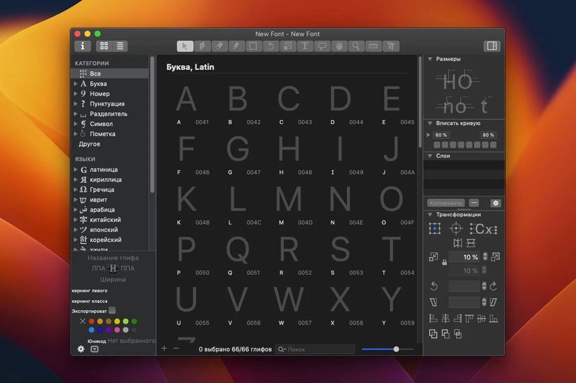
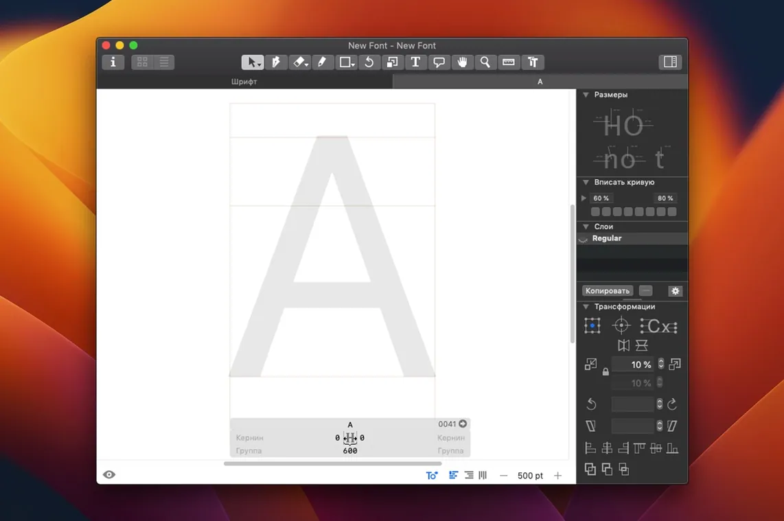
How Glyphs Stacks Up Next to FontLab and RoboFont
Type designers tend to split into a few camps, and the loudest neighbor to Glyphs is FontLab. FontLab 8 is the old guard — absurdly deep, cross-platform, and packed with tools that predate OpenType. If you need to open a PostScript Type 1 suitcase file from 1998, FontLab is your app. But all that history comes with an interface that feels like a cockpit, full of palettes and modal dialogs that can slow you down when you just want to draw. Glyphs strips that back. The Smart Glyph approach — where you draw components and the app constructs related shapes — is more direct than FontLab’s layer-and-mask equivalent.
RoboFont is the other close cousin. It’s a blank-slate editor built on Python, meaning almost everything is a script or an extension you bolt on yourself. That’s powerful if you’re a coder who wants a custom UFO-based pipeline, but it leaves beginners staring at an empty toolbar. Glyphs walks a middle lane: the plugin manager and Python layer are there, but the out-of-the-box drawing tools are complete enough that you don’t need to script just to cut a counter or adjust stem widths. Where Glyphs pulls ahead is in the live previewing — FontLab has preview panels, but the Glyphs Viewer companion app makes checking your work in InDesign or Sketch feel like a native macOS feature.
Barely a Blip on an M1 MacBook Air
My daily-driver is an M1 MacBook Air, and Glyphs 4.1.1 barely registers in Activity Monitor while I’m drawing. A file with 600 glyphs and a dozen masters sits around 400 MB of memory — heavier than a text editor, but half of what a comparable FontLab session would use. Scrolling through the glyph list with the arrow keys is instant, and the spacing window updates with no perceptible lag even when I’m dragging sidebearing handles over a long test string.
Stability has been solid across a few weeks of daily work. I’ve had one crash during a Python script that tried to interpolate a malformed layer, but standard drawing and exporting haven’t tripped it up. Export times for a four-master variable font hover around eight seconds on the M1, which is quick enough that I don’t reach for my phone while waiting. On Intel Macs the same export takes maybe twice as long, but it’s still a background blip. One thing worth noting: if you’re working with huge CJK character sets, memory use climbs faster, and you’ll want 16 GB of RAM to keep the spacing window snappy.
A Real Workflow: Drawing a Stylistic Alternate from Scratch
Say I’ve built the lowercase «a» for a display serif, and I want a more calligraphic alternate that lives under the salt feature. Here’s the path I take inside Glyphs:
- Duplicate the glyph. Right-click the «a» in the font view and choose «New Glyph from Template.» I name it
a.alt— Glyphs recognizes the suffix and will auto-wire the OpenType code later. - Sketch the alternate shape. I use the pen tool to draw a single-story «a» with a longer terminal. The stem snapping keeps my weight consistent with the double-story version, so I’m not eyeballing thickness at 400% zoom.
- Check spacing live. I open the Edit tab, type «wave a.alt vast a.alt lane» into the text field, and watch how the alternate sits between other letters. I nudge sidebearings with the arrow keys while the string reflows — no guesswork.
- Set up the feature code. I click the «Features» tab, find the
saltsection that Glyphs generated, and see that mya.altis already listed. I add a quick comment reminding myself this is the calligraphic variant, and hit Compile. No manual OpenType code needed. - Test in a layout app. I fire up the Glyphs Viewer companion, toggle it to my working .glyphs file, and paste the same test string into Pages. The alternate pops in immediately. I go back to Glyphs, tweak the terminal curve, and the Viewer updates as soon as I save.
That whole loop — idea to tested alternate — runs under ten minutes because the app handles the plumbing. I’m not hand-writing feature code or exporting a font file just to see if the alternate works. For anyone who has chased a broken substitution across a five-hundred-line .fea file in another editor, that alone is a reason to keep Glyphs open all day.
Build 4200 gathers the developer’s newest fixes and refinements to keep every curve and contour feeling tight and predictable.
- macOS 12 or later
- Apple Silicon & Intel 64-bit
Also on readers' docks
Sign in or create an account to leave a comment.
No comments yet. Tell me how it got on with your other devices.