









Download GraphPad Prism for macOS
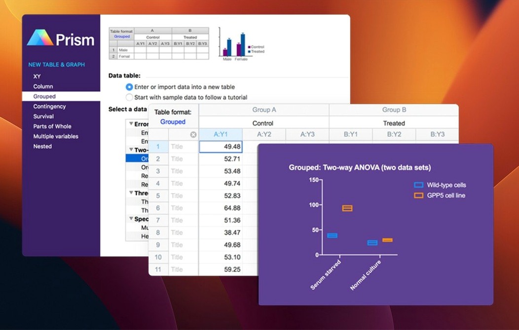
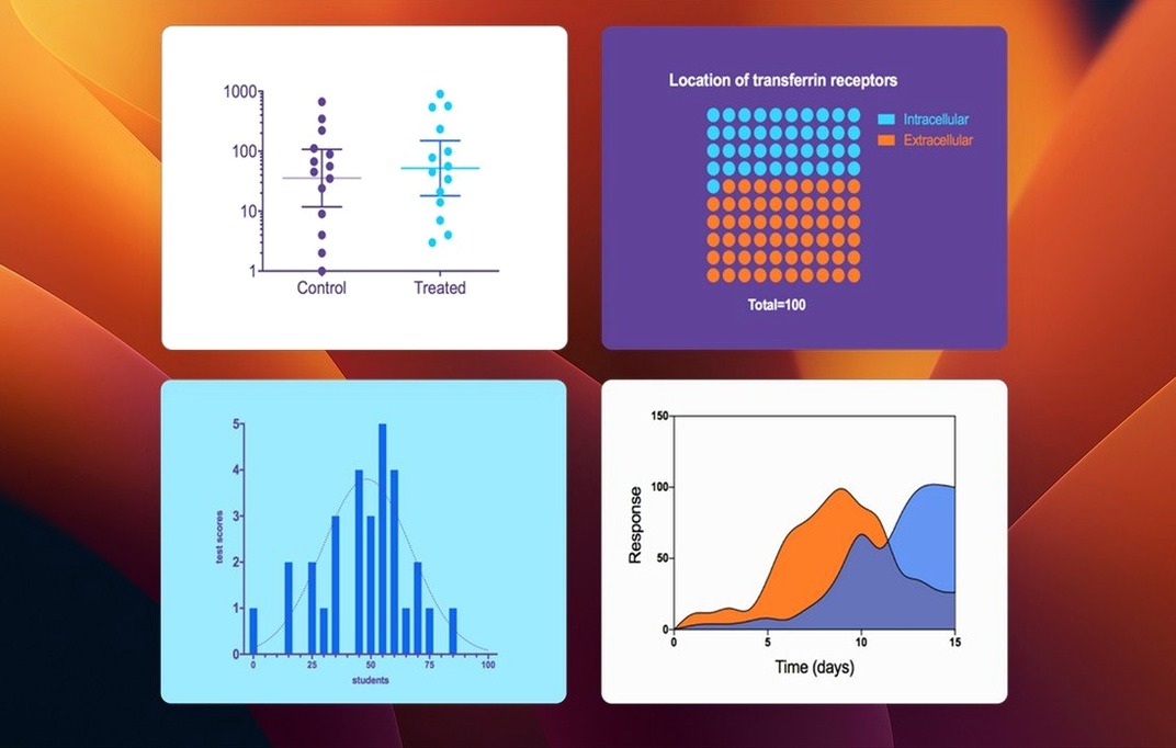
Working scientists, grad students, and anyone who spends serious time with dose-response curves or survival plots tend to know Prism by name. It's the app they reach for when Excel's chart options feel like a toy and R's command line demands more coding than they signed up for. GraphPad Prism bundles biostatistics, nonlinear regression, and publication-quality graphing into a single workspace built around the way researchers actually think about their data.
The core idea is that your experimental design dictates the analysis, not the other way around. You pick a method—say, a t test or a two-way ANOVA—and Prism guides you through the parameters without making you dig through obscure dialog boxes. The latest 11.1.0 release tightens this further with streamlined variable selection in key analysis dialogs, including nonlinear regression and simple survival analysis.
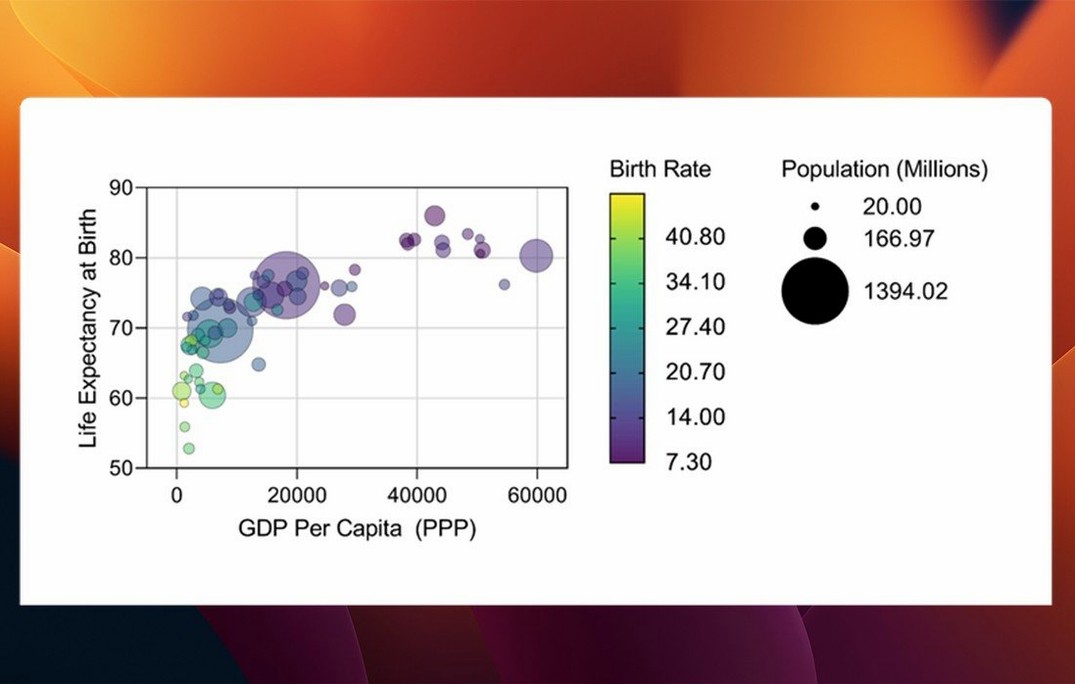
Graphing feels like a natural extension of the analysis rather than an afterthought. New graph types for multiple variables tables landed in this version, along with categorical level ordering that gives you proper control over how groups appear. Under the hood, more than 60 bug fixes shipped too, which says plenty about how actively the Mac version is maintained alongside Windows.
It's not casual software. If your work involves curve fitting, statistical comparisons, or figures destined for a journal, Prism fits. If you're just making a pie chart for a quarterly report, it's overkill—and that's exactly the point.
Mistakes Beginners Make Right Out of the Gate
I've watched enough lab mates trip over the same hurdles that a few patterns stand out. The biggest one is treating Prism like a spreadsheet. People paste raw data into the default table format without checking whether it actually matches their experimental design. Prism uses six distinct table types—Column, XY, Grouped, Contingency, Survival, and Multiple Variables—and picking the wrong one sends you down an analysis path that doesn't fit your data. You'll wrestle with grayed-out options and wonder why the t test you wanted isn't available. It's almost always a table mismatch.
Another classic is ignoring the analysis checklists. Prism generates a detailed interpretation tab after every statistical test, complete with normality checks and recommendations about whether you've satisfied the assumptions. Beginners skim it and jump straight to the graph. Later, a reviewer asks about equal variance, and there's no answer. The checklist sits right there, unread.
Naming data tables something cryptic like "Sheet3 copy" is a slow-burn mistake. A project with twelve analyses becomes unreadable fast. Descriptive names—"Dose-response run 2" or "qPCR knockout vs WT"—save your future self from clicking through every tab hunting for the right dataset.
Walk Through a Tutorial Data Set First
Start by loading one of the built-in tutorial data sets, even if you're itching to analyze your own results. The welcome screen links to them, and each one walks through a specific workflow—nonlinear regression, grouped comparisons, survival curves—with annotations explaining why certain choices appear. Spending an hour with three or four tutorials builds muscle memory for the table-type decision that trips up so many newcomers.
Set your graph defaults before you produce anything meant for a figure. Open a blank graph, adjust font sizes, axis thickness, colors, and the overall look to match your lab's or journal's preferences, then save it as a template. Prism applies templates globally, so every subsequent graph inherits those settings instead of the slightly-too-small default Arial labels. It's a one-time time investment that stops the late-night reformatting scramble.
Check the preferences pane for the "Graphs" tab and toggle on "Show interpolated values" if you do dose-response work. It's off by default, and missing it means you won't see the calculated EC50 or IC50 values on your curves until someone points out the option exists.
Fix the Missing-Value Analysis Error
A recurring headache is Prism refusing to run an analysis because of missing or excluded values. The data table shows a blank cell, and the analysis dialog throws a vague error. The fix is usually simple: right-click the cell and choose "Exclude value" deliberately rather than leaving it empty, or use the "Handle missing values" dropdown in the analysis parameters to tell Prism what you want. It's pickier than Excel about blanks, and that's actually a feature once you know how to manage it.
Multiple comparisons output can feel like drinking from a fire hose. Users run a one-way ANOVA, get four different post-hoc test options, and freeze. Start with Tukey's if you're comparing every group to every other group, or Dunnett's if you're comparing everything back to a single control. The results tab labels which comparisons are significant with asterisks that match the graph annotations—focus on those first, then dig into the full matrix if you need exact P values.
Graph updates not reflecting analysis changes is another common grumble. If you tweak an analysis parameter and the linked graph looks unchanged, check whether the graph is still linked to the correct results sheet. Sometimes duplicating a graph severs the connection silently. The fix is to re-link it from the graph's "Change" menu under "Data set."
Dose-Response Curves with Weighted Four-Parameter Fits
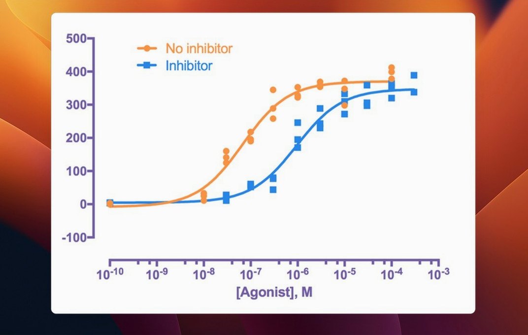
Pharmacologists and toxicologists doing dose-response curves get the deepest value here. The nonlinear regression engine handles four-parameter logistic fits with as much nuance as you'd want—variable slopes, constraints, weighting by 1/Y²—and the output includes confidence intervals for EC50 values without extra steps. If your day involves IC50 determinations and Hill slopes, Prism's workflow is built around exactly that rhythm.
Biomedical researchers running repeated experiments with small sample sizes benefit from the built-in guidance. Prism won't let you run a parametric test on n=3 without at least flagging that the normality assumption is shaky. It nudges you toward nonparametric alternatives when appropriate, which is a quiet safety net for people who aren't professional statisticians but need statistically sound conclusions.
Graduate students preparing their first manuscript figures find the graph export options genuinely useful. Vector PDF and EPS output at user-specified DPI means no pixelated charts when the journal's production team scales your figure. The layout tool for arranging multiple graphs on a single page for multi-panel figures saves a separate round-trip through Illustrator. It's not a full desktop publishing tool, but it covers the gap between analysis and submission-ready artwork that most stats packages leave wide open.
Version 11.1.0 brings a handful of welcome improvements for researchers juggling complex datasets:
- New graph types designed specifically for multiple variables tables.
- Categorical level ordering for multiple variables data, giving you control over how groups are displayed.
- Streamlined variable selection in analysis dialogs, making parameter setup faster for common tests.
- macOS 11 or later
- Apple Silicon or Intel Mac
Questions people ask
Is GraphPad Prism available for Mac?
Yes, GraphPad Prism is available for both Mac and Windows. The Mac version requires macOS 11 or later and runs on Apple Silicon as well as Intel Macs.
Also on readers' docks
Sign in or create an account to leave a comment.
No comments yet. Tell me how it got on with your other devices.