









Download Sketch for macOS
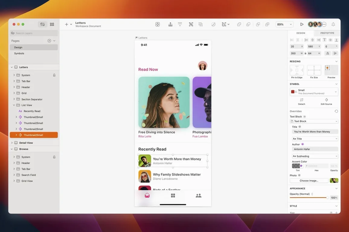
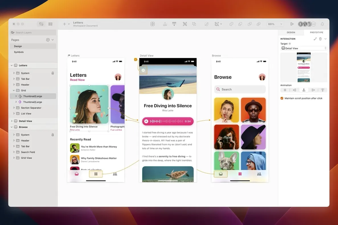
Smart Layout resizes a button label on the fly, and that's where we start—turning a rough wireframe into a polished mobile checkout screen. Sketch — the Mac-native vector tool for screen design and prototyping. Grid — a configurable layout guide for precise placement. Artboard — a fixed frame representing an iPhone 16 screen. Vector tool — the pen for drawing custom icons directly on the canvas. Symbol — a reusable master component, like a shopping cart badge, that updates everywhere when edited. Prototype link — a wired connection between artboards that simulates a tap through to the confirmation view. Plugin — a third-party add-on, such as a content generator, that fills placeholder fields with realistic customer names and prices in one click.
Batch-Rename Layers with the Rename It Plugin
A lot of Sketch's best tricks hide in plain sight. The Rename It plugin isn't built in, but once installed, you can batch-rename layers by typing something like %N - Button and watch a stack of thirty rectangles get sequential names instantly. That alone cuts ten minutes of clicking from a dense artboard.
Holding Option while dragging a layer duplicates it—everyone figures that out. Fewer people notice that holding Option + Command while dragging a guide from the ruler creates a guide that spans only the current artboard, not the whole canvas. On a page with five phone screens side by side, that's the difference between tidy and chaos.
The Distance measurement feature wakes up when you select one layer and hover over another with Option held. Red guides appear showing exact pixel gaps. Newcomers often nudge things by eye; veterans tap Option and know the spacing is precisely 16 px, not "about there."
Another gem: the Make Grid tool under Arrange. Select a bunch of items—say, avatar thumbnails for a team section—and Sketch distributes them into a neat grid with one click, preserving spacing and alignment. It saves the drag-and-guess dance entirely.
And if you haven't tried Sketch's built-in Math operators in the Inspector, you're working harder than you need to. Type 360/3 into a rotation field or 100%+20px into a width field and Sketch calculates it on the spot. No calculator app, no mental arithmetic—just type and confirm.
Stop Duplicating Buttons Without Symbols
The most common stumble is ignoring Symbols early on. A new designer draws a button, copies it across ten artboards, then needs to change the label color. That's ten manual edits. Turning that button into a Symbol—even retroactively with Replace With—makes it a single source of truth. The fix takes seconds, not a lunch break.
Another trap: using raster images where vectors would do. Dragging a PNG icon into a layout works fine at 1x, but scaling it to a larger artboard reveals soft edges. Drawing or importing a vector icon keeps things crisp at any resolution, and Sketch's vector tool is friendlier than most people assume—try the Vector mode's rounded corners slider before reaching for an image file.
Beginners also tend to nest artboards inside groups without realizing it breaks prototype links. A clean page structure—artboards at the top level, everything else inside them—keeps the prototype wiring intact and previews running smoothly.
Then there's the oversized canvas. Dropping a dozen full-page artboards onto one Sketch document without using Pages to separate flows (onboarding here, settings there) turns the canvas into a scroll-heavy maze. Pages cost nothing; clutter costs focus.
Lastly, many people skip Color Variables and hardcode hex values everywhere. When the brand palette shifts—and it always does—updating one variable beats hunting down forty-two individual fills.
What the Florence Release Changed in Daily Use
Version 2026.3.1 brought the Florence feature set into everyday hands, and the first thing you'll notice is that document windows now follow the system corner radius of macOS. It's a small visual shift, but it makes Sketch feel less like a standalone island and more like a native citizen of the desktop—especially on macOS Golden Gate, where window styling is more pronounced.
Under the hood, a stack layout bug got squashed: text layers with a minimum width set no longer misbehave inside stacks. If you build card components with dynamic labels, this fix means your text won't unexpectedly collapse or overflow when the content changes. Layout consistency is the quiet hero of screen design, and this patch earns its keep.
For those on macOS Golden Gate, three targeted fixes land. Tooltip clipping near the screen edge is gone—no more truncated hints when your Inspector sits too close to the right side of the display. The Rename Selected Layers sheet had a text alignment glitch unique to Golden Gate, now resolved, so renaming layers reads cleanly again. And a curious one: using Writing Tools while the canvas was blank previously rendered nothing; now the content appears as expected, which matters if you're drafting interface copy directly on artboards with system-level writing assistance.
These aren't flashy additions, but collectively they remove friction points that interrupt flow. A tooltip that reads fully, a text layer that stacks correctly, a window that looks right on your screen—that's the kind of polish that keeps you in the work instead of fighting the tool.
Flipping Between Three App Pages for a Fintech Redesign
Imagine a freelance designer wrapping a fintech app redesign. She opens a Sketch document with three Pages: one for the onboarding flow, one for the dashboard, and one for the transaction detail screens. The dashboard Page holds eight artboards—iPhone 16 dimensions, each representing a state: empty, loading, populated, error, and a few edge cases with long account names.
She pulls a Symbol for the balance card from her team library, swaps in a Color Variable for the new brand green, and watches every instance update across all eight artboards. The card's label uses a Text Style tied to the design system, so fonts stay consistent without her checking each one. She needs a quick custom icon for a recurring payment indicator—three arrows in a circle. The Vector tool gets her there in under a minute, snapping points to pixel grid with the Round to Pixel setting on.
When the client asks to see the tap flow from dashboard to transaction detail, she wires the prototype links with a few drags, opens the Sketch Mirror companion, and walks through the screens on her phone as if it were a live app. A spacing issue catches her eye—the back button sits too far from the edge. She holds Option, hovers, sees the red guide say 24 px instead of 16, nudges it, and the prototype updates instantly.
By the end of the session, she exports assets at 2x and 3x for the developer handoff, knowing the vectors will stay sharp on every device in the spec. No raster artifacts, no last-minute scrambling. The whole flow—from wireframe bones to polished, tappable prototype—lived inside one Sketch document, on one Mac, without a browser tab in sight.
Version 2026.3.1 brings the Florence release features forward with a nod to macOS Golden Gate. Document windows now follow the system corner radius, a stack layout bug tied to text-layer minimum width has been squashed, and other minor improvements keep things ticking.
- macOS Sequoia 15.0.0 or newer
- Apple Silicon or Intel Mac
Also on readers' docks
Sign in or create an account to leave a comment.
No comments yet. Tell me how it got on with your other devices.